
Why I Paint in the Light: High-Key Painting, Hope, and the Art of Storytelling

I almost gave up on painting once.
Over a decade ago, when I was in my first art collective, a few online comments suddenly made every bright, airy canvas I'd ever made look like a huge mistake.
Thankfully, a mentor spent the next year teaching me about my style, and I didn't lose my nerve.

I wrote about how I bounced back, and about what key in painting means in Shattering art style: High-Key, Mid-Key, Low-Key painting... and me. If you want the art-school version, with Artemisia Gentileschi in the shadows, and Mary Cassatt in the sun, start there.
This is the other half of that story: Why I chose light. And why I'm still choosing it, every time I pick up a brush.
A quick refresher on key
Every painting and painter has a key: in other words, the overall lightness or darkness of its values.
Low-key work lives in the shadows where light carves itself out with contrast. Mid-key holds a beautiful balance and tension between both. High-key paintings are dominated by light tones, with very few darks. They can feel airy, clear, and optimistic.
But you probably know the technical jargon. There's a hidden element about it that nobody really teaches you in school, though.
Key is like the first sentence of your artist’s bio. It tells people who you are before you've said a word. And people will have you believe there's only one wrong way to start that sentence.
A light one.
The high-key.
Light by design.
Just so you know, and because it matters to the conversation, I'm a novelist as well as a painter.
I’ve written 25+ books in 3 series with more to come -- just search Tracy Eire if you need proof (and if you're among the readership around here, I do have something in the works)! Writing novels means I tend to think of a painting as a story told in a single frame, and the credo may be dusty, but one very famous -- and overused, by the way -- rubric goes that ‘You should show more than tell’.

As I put it in my artist statement, I really can see battles waged and won, heroes rising wherever I look. That's why my favourite quote comes from the Chorus of Aeschylus' Agamemnon, the first play of the Oresteia: "Cry, sorrow, sorrow. But let good prevail."
Light is how I show hope.
Oh, and it’s not about pretending the shadows don’t exist. It’s about trying to put back what’s been lost or taken from people. What’s missing.
Weak. Sold.
High-key art is slow to come to light. Which is ironic.
Doing it well takes a lot of practice and dedication. Getting it taken seriously takes even more.

Because there are doubters.
Here's a good example of what I mean.
Rendered in high-key, my Hall of Heroes - Valkyrie is a shrewd protector. She's been around the block, and that’s resulted in some epic side-eye. She guides souls to the other side with ease -- just a look -- protecting the women and girls who had to fight their whole lives, with the keenness of an arrow and the shield… of a mother.
I gave her gold leaf, because of course I did.
Luckily my mentor's lessons stuck with me, because it didn't stop the doubters.
Months later I was taking strays at a portfolio review with a different pro and I was told ‘Let's talk about that one. That is definitely the weakest piece’.
And I didn’t argue. I didn’t say a word. I felt I shouldn’t mention that she'd had sold the same month I'd painted her, because I was embarrassed and I didn't want to sound disrespectful. (Yeah, I know. But my head is often full of this sort of thing.)
That day, my feedback was all about my high-key style and I was told how it was defective. I listened, but I also stared at a little black box in the corner of the work. The ‘Sold’ marker on my storefront. I found myself almost willing the man to either see or pay attention to it. Because selling anything is hard -- books, short stories, paintings, all of it.
He never acknowledged it. And I couldn't square the two things about that painting with one another.
Weak. Sold.
The opinion of a critiquing artist against the opinion of an art collector.
By the end of that conversation, I knew very well that my problem was my style. Or, more pointedly from his point of view, my lack of style. Because, to this man and so many people who don't know about key, there is only mid-key or low-key.
And I wasn't either of those.
What I didn't say.
High-key art is often put down to inexperience and timidity. High-key painters can get a perpetual 'You must be new here...'
The truth is, I'm not new to art, or inexperienced. I just couldn't say that in the room. I was too worried it would be read as making excuses, or rudeness.
So, here's what I didn't say.
Before I began painting for the Eclipse Art Auctions collective (Studio Eclipse), I'd been working with Duo Aqua water-mixable oils for about a decade. When the mediums and solvents became biodegradable and non-toxic, I started painting in true oils. Now I use both. By the day of that review, I'd been in three art collectives, shown all over the world -- including selling at Red Dot Miami -- and won an award in Hollywood for paintings of mine that are now in a bestselling book. No jokes!
I'm not a lightweight. I just paint in the light.
Value does the work.
The critique's headline was my 'timid values.'
Stop me if you've heard this one: 'Value does the work; colour gets the credit.' It's true! And it's... just as true in high-key.
Done well, a high-key painting still has real value shifts. They're just softer and milder than what you'd see in low- and mid-key, and they sit higher up the scale. There are very few deep darks, so each one has to earn its place.
Here's a quick test: switch your photo to black-and-white. If the shapes still read, the values are doing their job -- in any key.
You can see key easily in these classical paintings by women Masters:
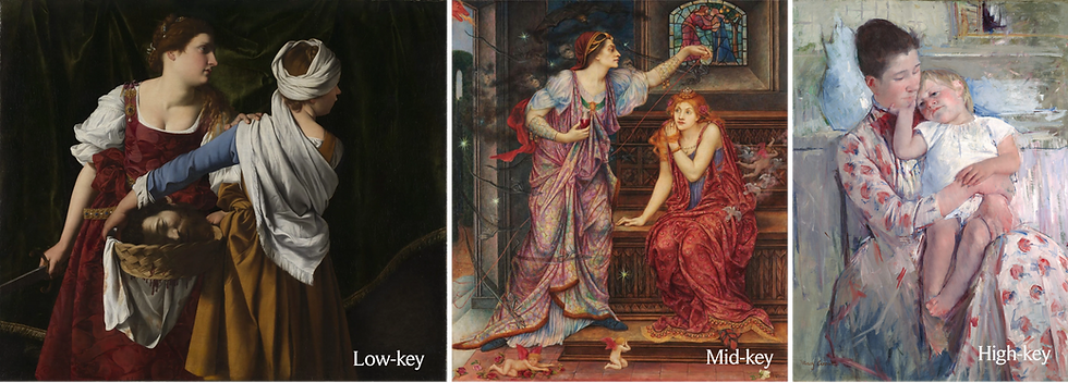
The first two keys are highly legitimized by the public: low-key, as shown by the peerless Artemisia Gentileschi, and mid-key, by the amazing Evelyn De Morgan. The last is high-key: Mary Cassatt... clocking in with the earliest version of the viral strawberry dress ever. Nice!
Nowadays, Cassatt's light key style might easily be misread as a sign of low skill and inexperience -- someone afraid of deeper darks because she... doesn't know what she's doing.
Folks, all these ladies knew what they were doing.
But there's a reason for the misread. Artists starting out tend not to want to apply dark paint, or they use it sparingly, fearing it will destroy what they've built so far. So beginners often paint light.
That doesn't mean painting light makes you a beginner.
Timidity can cause a light painting. A light painting doesn't prove timidity. Failing to separate the two is what hurts the reputation of high-key art -- and it doesn't make Cassatt any less legit.
We really need art schools to step up and correct the misconception. A light painting may be an artist's style. For real. Not the mistake we hear echoed back by people who don't ever think, and may not even know, about key.
Same hand, different key.
In truth, every artist has a range of skills. We can produce vastly different types of work and often have fun doing it. My style is solidly high-key, but here's how I look across low-key, mid-key, and high:

Are my lows as intense as a low-pro? Absolutely not! But low-key painters generally don’t fault my effort. Nor do mid-key painters call my weeping Banshee -- the girl in green mourning all our fates -- middling. Not that I’ve heard.
So why is it that my fading Tigress -- coming from the same artist, with the same experience -- is less valid work?
Same hand. Same skill. It’s just in another key. Another avenue to beauty.
I think it’s high time we started to acknowledge high-key art as genuine. Because when we don’t, we miss out on so much beauty.
And we browbeat fellow art professionals. Without ever meaning to.
Bringing it home.
If you've read this far, you might be wondering what all this philosophy looks like on a wall.
Here’s the short version.
A high-key painting doesn't swallow up a room. But it can open one. It can catch morning light and hold onto it after dusk. It can look as ethereal as a dream. And because every piece I make starts as a story, you don’t just hang random pretty colours up on your wall -- this is a character, with a message, and she glows with a hope of her own.
Now that doesn’t sound so bad, does it?
Why I paint in the light.
Once upon a time, I was convinced my obsession with light and how I painted my figures was an unresolvable flaw. I would get critiqued and no one would dig deeper than 'this should be darker'. It was mid- or low-key, or bust!
But it wasn't a mistake. It was my voice.
Realizing that has made it possible for me to consciously expand my artsy repertoire.
But I always come back to my signature style.

I paint in the light because I believe stories should leave you stronger than they found you. Because the women and girls I paint deserve to be seen clearly. And because hope, like light, is something you can choose to let in.
Professional critiques can -- and should -- say way they will. I say this because I’ve learnt so much from them! But, don't be like me. Don't sit silently as they walk all over your legitimacy as an artist. Name your key before they do!
Next time I'll try something like: 'This is a deliberate high-key piece. Within that range, where are my values not working?' A good critic's ears will prick, and they'll take you up on that. Then I'll get feedback I can use.
Even if they can't hear you in that key, there's nothing amiss about a practised high-key style.
There never was.
But artists... what do you think?
PS - You can see what's available in my art store. Stop in! Say hello!

Comments